Saturday, October 31, 2009

Mixed greens

I know that everybodies monitor is calibrated differently but here are the various mixtures I have been describing. They all contain enough white to open up the note so you can tell what it looks like. Above is ultramarine and cadmium yellow. Every different manufacturers cadmium yellow is a different shade too, so there is another variable. Theses are all RGH colors in these examples. You will need to make your own samples if you want to study this. Below is ultramarine plus yellow ocher.

Below is pthalo blue plus cad yellow.

And pthalo plus ocher.

Then black plus cad. yellow.

And then black plus ochre.

Here is cobalt blue plus cad. yellow.

and cobalt plus yellow ochre.

And lastly I mixed a bright pink into a pthalo green.

I make and keep a tube of pink for subduing greens. You could use flesh color or cook up your own. Mine is very bright, but it is the opposite of a strong green as one makes out of pthalo. Williamsburg makes a color called Persian Rose that works very nicely. I use this and all my other reds to further modify the greens I have shown you above. By doing that I can get LOTS of different combination's. Notice the pink to green example gives a warm neutral in the middle.

Friday, October 30, 2009


Here are some tubes of Lefranc. I think if you are buying paint in tubes this is the best brand for the money. However their viridian is strangely expensive, I am not sure why, the rest of their line is very reasonable and it is great paint. I use RGH for everything except I use Lefranc white. I may have caused a run on Lefranc white because both Jerrys and ASW are sold out, but they will restock.

Last night I discussed tubed greens, tonight I will return to mixing greens. As I am certain you know the general recipe for mixing greens is to add yellow to blue.
There are about four or five blues that I an likely to have around, though not all at once. They are
  • ultramarine
  • pthalocyanine
  • Prussian
  • cobalt
  • and ivory black
Ivory black? yep, When I am working on my restricted earth color palette that's my blue. In order for that to work though the painting has to be very warm. With the rest of my earth color palette that is assured anyway. I am going to mix and match those blues with these yellows:

  • yellow ocher, or gold ocher
  • cad yellow light, or pale
  • cad yellow medium I don't put this on my palette or............
  • cad yellow deep, but I have em around if I need them
  • mars yellow This is a sort of super ocher, You would have this instead of the ochers up top
  • I never use them but there are azo yellows and permanent yellows etc. that you might have.
I tend to prefer the gold ocher to the yellow ocher, it is just what it sounds like, a yellower version of ocher. I like its being a little yellower, particularly if I am making my greens out of ivory black alone. It gives a little greener hue. That green, is of course only green compared to the rest of the painting. In a painting containing a strong pthalo green it would merely appear gray. Every color in a painting appears the way it does because of everything else in the painting.

Taking the blues from the top, I use the ultramarine more and more with either ocher or more commonly cadmium yellow light. That gives a good workhorse green. Once I would have used viridian but this is grayer and I like that. My first choice combination for making greens is now this. I try to use a number of different greens in most paintings though. A great variety will carry you through an overly green painting.

I can make a bright naturalistic green in the summer landscape with either the Pthalo or the Prussian, and cadmium yellow. This green can get real oppressive in a hurry. It will need to be modified or "stepped on".

Prussian blue is probably not something you will use because pthalo has largely replaced it. It is already slightly green and I like that about it. It makes a set of greens that have a particular look to them. I see it in a lot of paintings from the first half of the 20th century. John Carlsons paintings seem to be full of these greens. Like the pthalo, Prussian makes a lot of greens that are very assertive and they will often have to be toned down.

I don't use cobalt all that much , but I usually have it with me. About twenty years ago I used to work on a three color palette containing cobalt blue, cadmium yellow light and genuine rose madder. I made all of my greens out of cobalt. They had a delicacy to them that I liked and were not too electric as can sometimes happen with pthalo or even viridian. Sometimes I will make cobalt based greens when I have exhausted the possible greens I can make with my other colors and I want yet another green variation, say in a garden where each of the plants could be characterized by a different green.

I suggest that you experiment with the blue and yellow combination's you can make from your palette on a piece of leftover canvas or panel and keep it around to look at . You need to know all the different greens you can make.

Tomorrow I will talk about stepping on them. Making all those different greens is only half the solution to the problems of handling the most common color in the landscape, at least most of the year.

Thursday, October 29, 2009

More about greens

Green Marmot, possibly from Ireland

I am going to continue talking about greens tonight by addressing some of the greens that you might have on your palette. My e-mail filled with questions about this and that green so In will describe a few of the common green pigments. Usually in small type on the tube are a couple of letters and numbers that will tell you what is actually in the tube. I have included those below.

There aren't all that many common green pigments in the art game, there are a lot of reds and yellows, but only a few greens. Here are those you will run into, and one you won't.

Viridian, (PG18 in the code on the tube) has been for a long time the standard artists green. It is made from hydrated chromium oxide,(whatever the hell that is) Viridian is a bluish green that is permanent. In recent years it has become expensive. I have had a problem with its being gritty on the palette.When mixed with cadmium yellow it will yield a foliage color in sunlight. Viridian is graduallyt being replaced on many artists palettes with............

Pthalocyanine green, often referred to as thalo is a powerful color discovered in the early 1900's. Thalo can be hard to manage due to its great pigmenting strength, it is what you get if you buy a tube of green marked with the words viridian hue. Manufacturers market it in different shades from a yellow green, to a cool blue like viridian, which is what I use. I mix most of my greens but lately I have had Pthalocyanine green deep from RGH on my palette.Remember that every manufacturers "deep" will be a different shade.

I used to use sap green, which was made from buckthorn berries. It was impermanent but a wonderful hue. It was transparent and had a brown, sort of whiskey color under its green. Sap green today is nothing like that and is a mixture of thalo and who knows what else. That varies with the manufacturer. I have no use for the hue today called sap green.

Chromium oxide green, (PG17) is a chromium color related to viridian, it is opaque, permanent and a dull green -yellow . It is a useful landscapists color. I think Metcalf used a lot of it. Give this color a try if you are experimenting with greens, it is not too powerful and goes well with earth colors.

You will never use emerald green , but it was once a common color. It was also called Paris green, and was copper aceto-arsenate. Besides being a green pigment it was an important insecticide in the 19th century. Deadly to bugs and artists. I mention it only as trivia, you will never see it as a pigment on your palette.

Cadmium Green, is an expensive mixture of cadmium yellow and usually cobalt. it is a permanent and opaque color that is not widely used because of its expense.

Terra Verte is an earth color made from a greenish clay. Generally today manufacturers use a mixture of burnt sienna and a blue instead of the real thing. It is a dull green with little pigmenting strength that is often used in underpainting flesh in Italian style paintings that will be painted in glazes.

Pretty much everything else out there is a mixture of pthalocyanine and a yellow pigment given an attractive and sometimes descriptive name by its maker, like olive green or vegetable green, etc. The pigment code for thalo is PG 7 and PG36 if either of those codes are on the tube, you are getting thalo .

Wednesday, October 28, 2009

About mixing greens

Jervis McEntee courtesy of artrenewal.org

I was asked in an e-mail to discuss how I mix greens , so I will write about that tonight. For many years I had viridian on my palette as my standard green. I began using it when I was studying with Ives Gammell and it was the standard landscape painters green. However in the last few years the price of viridian as risen tremendously as its quality has fallen. I have been working without it for this year, I don't know that I will continue as RGH still makes a reasonably priced viridian that is of good quality. There is a link in my sidebar for them. I use them for all my colors except white. They make a good white too but I am fond of the LeFranc.

Instead of the viridian I have been using a pthalo green deep by RGH. It is not there because it is just like viridian , because it's not, but because it is a green that will work, and its not too yellow. Many of the proprietary greens made of pthalo are too high key, electric spring green, Salem menthol for my taste. This RGH pthalo deep is cooler, but it has a lot of pigmenting strength still like any other pthalo. I can deal with that but it took a bit of getting used to.

I have experimented with other solutions in recent years too. I have used both Prussian and pthalo blue. Both of those worked about the same as using the pthalo green. The Prussian is a controversial color with some defending it, and others saying it is impermanent. So I am not advising that you adopt it on your palette, you will probably want to use pthalo. The Pthalo colors give a range of strong, clean greens. They need to be "stepped" on much of the time by adding various other colors. Emile Gruppe used a pthalo on his palette with a full quiver of cadmiums to influence what he made from it.

The three color guys from out west, pack ultramarine and cadmium yellow, and taking a cue from them I have made a lot of greens in recent years from those. That has the advantage of not yielding greens that are too assertive. In the summer particularly the landscape can be VERY green. If you want that very green look, you can get it with viridian and cadmium yellow light. I was taught to make greens that way, but I came to feel later that although they looked like what was in front of me, they were to assertive and monotonous. In have tried in recent years to keep my greens well in check. I sometimes have joked in this blog about painting in the color of 500 dollar suits. You don't see those loud green suits on the racks at Brooks! You do see some green nylon parkas out there that are the colors I am talking down, they come from the discount stores though.

We are making paintings to go into peoples homes and be lived with, at least I am,. Some artists are making paintings to impress other artists or to go into museums or whatever, but I expect people to live with mine as decorative objects. I therefore don't want them to be the color of a granny Smith apple.

The painting at the top of the page is a good example of a restrained green, they are grayed or reddened until they are a neutral color that doesn't scream at you from the painting. Green is sort of the landscape painters enemy, there is so much of it and it is not always the most attractive color I can place on a canvas. The more I can push it towards gray often the better it is.

Here is a John Constable, look how restrained his greens are. Whenever I walk into a museum I always feel like the color in my paintings should be more subdued. We have such powerful pigments today, but I am not convinced that more color is better color. I have been painting graver paintings of late and I think I will head more that way.

Tomorrow I will talk about mixing less assertive greens.

Tuesday, October 27, 2009

Hudson River Workshop, fall 2012


Hudson River Workshop

 The workshop will start on Saturday, October 13 and run three days through Monday the 15th. It will be held at the Carriage house studios in Newburg, New York. Garin Baker will be our host and special guest star.

The schedule includes;

  • a demo every morning, on the first day I explain the palette and the various pigments.
  • In the afternoon the students paint and I run from easel to easel doing individual instruction and try to diagnose each students particular barriers to better painting.
  •  after the demo each day I run  a series of exercises  teaching root skills like creating vibrating color and the parts of the light (that is what you need to know to establish light in a painting) I am going to add a new exercise this time on color mixing.
  • I do a presentation before dinner with images from my laptop. One is unpacking  the design ideas in the works of great landscape painters, particularly Edward Seago and Aldro Hibbard, two favorite artists of mine.
  • I promise I will work you like a borrowed mule. 
  • I can save you years of screwing around

There should be some autumn color by this time. This is getting into the best time of the year to paint outside. This is sacred ground to American landscape painting. I will talk a little about their working methods and show some examples of this art as well.

This is a workshop only, no lodging is required  you may stay at your homeif you are  close enough or in a motel of your choice in the area. I don't make lodging recommendations because everyone seems to have their own preferences that are different  from mine, I like cheap!

The cost of the workshop is 300 dollars. I require a payment of 150 up front as a deposit. I will hold your space. The deposit is not refundable , I don't give em back if you don't come. So please don't sign up unless you plan to be there.


Ask Stape 3


Dear Stape:

I'm finding that photographs of my paintings are poor representations of the original, especially portraits, which tend to look flatter than the original pictures, and less subtle, as if transitional passages have been homogenized. I'm using a 6 megapixel digital camera and shooting with available light inside the studio which is decently lit with a skylight. The biggest difference between my portrait/figure painting and landscapes is that the portraits are painted employing indirect techniques such as scumbling and glazing.
In your opinion, what is the best approach for photographing paintings for one's portfolio?

Big D.

Dear Big D.

I am not an expert either, but I am able to take decent photos of my paintings most of the time. I have a black felt cloth that I shoot them against. I do my photography in the shade outdoors, but I also have a setup inside that is permanent and lit with floodlights. Recently I haven't used it much.
I set the paintings on a bench against the wall of my house, against the black cloth which I have hung with pushpins in the wood siding. Part of your problem may be that you don't have enough light in your studio. I take a couple of shots and recompose each one trying to get them square in the viewfinder.If I need to I lay a bright white piece of cardboard as a reflector in front of the painting to bounce some more light up into it.

I have a very ordinary Sony pocket camera that takes 7.2 megapixels. My wife waltzed happily into my studio a year or two ago saying "Stape! I got a great deal on a new camera for you! You don't care if its pink do you?" For my purposes it works fine.
The answer to the problem has changed since the old days of shooting slides and film. Now I open them up in Photoshop, I use then small version, Express, and I adjust them as best I can. I am beginning to wish I had the larger version so I could work in CMYK, and I may have to acquire that. My wife has it on her computer and is skilled in its use. I just don't think RGB. But for now that is what I am doing.You may have a different program for working up photos. I have friends who like different programs that they have and those often came with their cameras. I dont think they need top be very fancy to work, just logical.

I adjust the lighting, mostly I usually add a little contrast and lighten or darken the image as needed. The answer to getting your halftone right is probably here.The color adjustment is harder and I tweak it as best I can. Often the color is just off a little and I have but to back off the blue or something and it is ready to go. I used to have a pro shoot all of my advertising photos and it used to be 8 by 10 transparencies. I can't say that my work came out better then either. If you are uncertain of your abilities and working for reproduction in a magazine , you may want to go to a pro.For your own portfolio you should be able to take good enough shots yourself.

There are folks out there reading this who ARE expert photographers, I invite you to weigh in with your suggestions on this. That's the beauty of a ,sometimes it is a forum as well as my megaphone.
...........................Stape

Dear Stape

How do I prepare previous canvases when I want to overpaint with a new painting (oil over oil)? And what about impasto ridges on the previous oil painting?

Mick

Dear Mick:

I don't think you should. Canvas, at least cotton canvas is not terribly expensive. I suspect that you are intimidated by the prospect of stretching your own canvas. Don't be. It is not very hard. You can't just keep buying stretchers and not reusing them, that's ridiculous!


But if you must paint over an old canvas here is how to do it. Slip a piece of masonite panel under the canvas and in front of the stretchers so that as you work on the front you don't emboss the stretchers onto your canvas. Hold your palette knife by both the handle and the tip, like a draw-knife and cut the ridges of paint off the surface. Then sand it a little, 150 grit should do. Then paint it white or off white with titanium and a shot of liquin so it will dry in your lifetime. Then let it dry for a few days.

It is hard to get a perfectly smooth job out of this, if you are painting a finely rendered thinly painted piece this may be a problem. If you are doing an alla prima out door piece it may not be. I sometimes use a stiff brush and deliberately leave a texture in the white I paint onto my canvas. That will hide a few flaws. But I wouldn't get too thick on canvas. This trick is better on panels,. Why not make some of those. Heres how I do that.
..............................Stape

Monday, October 26, 2009

Samuel Morse 2


Above, later portrait of Samuel Morse by Mathew Brady, wearing medals presented to him by various governments. Samuel Morse was a complicated man and held some opinions that are shocking today. I think we would consider him a bigot and a nut today and I expect in his own time he was thought that as well. It is difficult though to compare opinions held by people from one era to the next.

Hollywood has made a zillion a historically themed movies wherein a character somehow possesses contemporary Californian beliefs and ideals but somehow mysteriously lives in the 19th century. Everyone around him is contrasted as backwards and stupid by the screenwriters. This is a historical narcissism where we imagine that we are so much smarter than a previous generation and can even tell ourselves smugly that "had we lived then, we would have not have held the opinions of the era"

But I don't think we are on that plane when we are faulting Morse for his ideas. Although he was a generous man who gave much to charity, Morse held that the abolitionists were wrong and turned to the Bible to prove it . He argued that God had OK ed slavery, as Christ never reproached the holders of "servants" and he encouraged those "servants" to serve their masters well.

Morse argued that the holders of slaves in the south were charged by God for caring for the four million or more slaves that he felt were to be redeemed, brought to civilization and Christianized by their owners. A description and excerpts of his dreary pro slavery writings can be found here.

Morse also ran on an antiCatholic immigration platform for the Mayor of New york in 1836. He received few votes. He also wrote a series of pamphlets and a book that argued that the government of Austria was in a conspiracy against the United States and was attempting to destroy our liberty by sending waves of Catholic immigrants to our country. If you would for some reason want to read this book ( and I can't imagine why you would ) it is here . I have presented this not so you may read it, but as a proof that these things are true. History tells us some things and leaves others out of the narrative.

As if that wasn't enough, Morse married his first cousin, once removed, Sarah Elizabeth Griswold.

Sunday, October 25, 2009

Samuel Morse

Since his name has come up in our conversation I thought I would do a brief post on American painter Samuel Finley Breese Morse 1791-1872. The son of a preacher, Morse was born in Charlestown (next to Boston) Massachusetts. He attended Phillips Academy and then Yale.

Morse traveled to England with American painter Washington Allston. The next time you are in Harvard Square walk over to the fence and look into the old burying ground there, and you can see his grave with the name Allston plainly marked on the stone. After training with Allston, Morse studied at the Royal Academy . Returning home he became a portrait painter, even painting President John Adams.In 1821 he painted a picture of Congress that is his best known work.

Morse was commissioned to paint a portrait in Washington and was executing it when a messenger arrived on horseback to inform him that his wife had died. By the time he could get back to his home in New Haven Connecticut she was already buried. He turned his grief to constructive use by working to discover a way to communicate quickly over long distances.

Although others worked on telegraphy at the same time, Morse was eventually credited with its invention. He sent a demonstration telegram from one room in the Capitol to another. His first message was "What hath God Wrought", a quotation from the book of Numbers.

Morse's patent of the telegraph was ignored and his claim to it disputed until he defended it legally in a case that went before the supreme court in 1853. The court under Justice Taney
(who later delivered the majority opinion in the Dred Scott case) found in his favor.

I will tell you more tomorrow as I must close tonight due to exhaustion. This is, incidentally, the 300th post I have done in a row without missing a day.Tomorrow night I will discuss Morse some more and show you the DARK side of his history, so stay tuned.

Saturday, October 24, 2009

The photos are again all places I have stood in the last week or so.

Tonight as promised I am going to list some of the things I think a painter needs to know. I don't mean that he needs to be expert on any of these, just that he needs to know a little about them. I am not a scholar either, and really don't know a lot about anything other than painting. A painter needs to know the his way around his culture, and particularly the art of our own nation. There are people reading this blog in other countries, some very far away, I don't mean to say that you should know American culture, although you're being here indicates you probably have an interest in that, but that you should know your own.


Some off these things are:
  1. the outline of American history and of the western civilization that produced the sort of painting I have been extolling.
  2. a familiarity with some of the great literary works of our history. There are some that have had larger influence on painting, Shakespeare for one, and Emerson for landscape painters. A lot of books could be on this list and it is probably important that you know some literature as much as what literature. You need to know a tiny bit about poetry and the theatre.

  3. You need to know the Bible, art and literature are full of references drawn from it. Before our present time a knowledge of the Bible was an assumed part of any education. Read it as literature if you like, but when someone says you can't make bricks without straw, you need to know where that comes from. "Whats the deal with Ruth and Naomi anyway?" Know Greek and Roman mythology, for pretty much the same reasons as above. You also should know a little bit about Arthurian legends. Skip Ossian, its a fake!
  4. You should be able to identify the historic style of architecture and know the relationship between it and the time in which it was created, and what that time was. You should be able to know by its appearance roughly when any building would have been built.You should also know a little about classical architecture and how that has influenced our own. You should know Gothic, Norman, Renaissance, Baroque and other styles common in Europe before our own American architecture was created. Know Asher Benjamin and Frank Loyd Wright.
  5. You should know the orders of furniture, that is you should know the difference between Chippendale and Eastlake. You should also be able to identify the period of a piece of furniture by its design. I don't mean that you should be an expert, able to spot clever fakes but that you understand the ideas that craftsmen were using when they created them.
  6. You should know the history of design of household items That would include china, stoneware, silver, wallpaper, textiles and apparel.
  7. You should know the history of Western music, the names and styles of the most major composers and be able to tell roughly the era in which a piece was written upon hearing it. You should know the similarity of music to the architecture and design etc. of those eras.
  8. You should know our more recent popular culture,that's not to say you need to memorize lengthy soliloquies by that dreadful Snoop Dog fellow, but you should know something about popular music. That would begin at about Steven Foster and move forward through time to include John Phillips Sousa, the blues, jazz, big band , Cole Porter, show tunes Duke Ellington, Otis Spann, Sinatra, Woody Guthrie, the Beatles and the British invasion, Hendrix, The Grateful Dead, and important modern composers like Copeland and Bernstein. I think it is OK to skip Shoenberg.
  9. I think you should know a little about industrial and mechanical design. Who is Raymond Lowe? What American portrait painter invented the telegraph?
  10. You should know the regional variations in taste that occur in all of the above, from Southern literature to New England transcendentalism to Western sculpture, to Chicago blues.
I am sure I could list more, but you get the idea. At least for me, learning about all of these things has been a delight and made my life more interesting. I don't think of culture as a boring and dry academic study. In fact I have the attention span of a gnat. If these things weren't fun to know , I wouldn't know them.

Friday, October 23, 2009

On cultural education and the artist


Above is another place I stood last week, near Laconia, New Hampshire.

So many of my opinions on painting are drawn from old books, and old men I knew twenty or more years ago. I will often make a statement that to me seems perfectly reasonable, that is now controversial but was once generally accepted in the art. I have based a lot of what I do on historical precedent, that is one of the things that interests me. So forgive me if I rant and rave a little. I mean well, I think.

An idea that has disappeared is of the artist as having a working familiarity with the achievements of his own culture. I am not suggesting that we should be expert on all matters aesthetic, but that an artist is better served by knowing something about his nations, art, literature, design, etc. than he is by an ignorance of it.

Our contemporary idea of the artist, at least in the press and the movies tends to be of the artist as wild beast, manchild, iconoclast, rebel, black clad hipster, and late night party attendee. All of these are laudable, and I demonstrated an aptitude for most of these in my misguided youth. However there was once a popular idea of an artist as a person of some refinement. Before today's concept of who an artist is became the norm, the artist was often expected to know the things that an educated person would know.

Today education often means a different thing than it once did. The colleges and university's turn out graduates who are trained to earn a living in the business or professional world. Many of our schools have become high class trade schools and have neglected to teach their students the liberal arts. I routinely meet people educated in the finest and most exclusive schools,( I do live in the Boston megalopolis ) who know nothing about their own countries artistic heritage. I have many times asked one of them,"Can you name me five American artists who died before 1900?" They never can, and often they went to Harvard or Brown! They have a lot of learning, but it is within their trade. That is, they know the law, or they know how to practice medicine or how to conduct a business. But that is not the same as a broad education. This is one of the reasons why much of the art in our magazines and galleries is so horrid. (I, of course, am not referring to you or anybody you know, I mean those OTHER people.) This art is the art preferred by those with money, but absolutely no knowledge.


I am occasionally asked "what should I paint if I want to be a successful artist?" I always reply "good paintings". But then I say something like this " If you just want to make sales though, here's what you should do". Boy, that gets their attention. " Copy photographs as exactly as you can, in bright colors, and paint with lots of contrast. That's what sells best. Almost every gallery I am in has an artist who does this and they are usually one of the top selling artists in the gallery. Often they use projectors to get their images onto the canvas"

Most of what serious traditional painters labor so hard to learn will certainly make them better artists, but that has little to do with sales much of the time. Those things are generally lost on many of the dealers and buyers of art these days. You can't blame them, they didn't learn about art in school. Yes, they had art class, but it was cut and paste. It was about them and their creativity, not about the historic art of their culture. Quality and sales are not that closely related, they can be, and if you want to make it as an artist, work for that, but there is a whole lot of truly awful art sold.

I think the explosion of interest in traditional painting will slowly lead many more people into a more sophisticated knowledge of painting, but not in this fiscal quarter. So I don't guess that I can argue that knowing about the arts will make you a more successful painter, but I think it will make you a better one.

If you told me you were learning to play Rock guitar (remember I love Rock and Roll) and I asked you what you thought of Chuck Berry, and you said "who?" I would assume you were not serious and might not get too far. There is no music without musicians and their music. The same holds true for painting, I think a painter should know the history of their art. That means knowing the major players in each period and what their paintings looked like. I don't mean you need to be an expert, but you should be aware of the general facts. When you go into a museum you should know most of the painting's authors WITHOUT reading the tags. That is why I have done so many posts on the history of American landscape painting, I do think that knowledge is essential for a landscape painter at least, and useful to all would be painters. I will soon return to more of those posts. I try to mix things up here. The goal of this blog is to lay out as best I can, the things a painter ought to know.

But I think there are other facets of our culture an artist should know . Tomorrow night I will list some of those things.

Thursday, October 22, 2009

Some views of New England and its stone walls

This blog is usually about painting, but tonight I am going a little bit afield. Let me show you some photos I have taken lately. I don't often work from photos but I take a lot, I always think I will......... I am not claiming the that these are "art", they are just some places I have stood this week. I have been showing the progress of fall through New England over the last month or so. I love old barns and houses, trees and hills. I spend a lot of time hunting painting locations, these are the result of that.

This is the public library in Tilton, New Hampshire, it must have started life as a meeting house. New Hampshire has this sort of architecture everywhere. Below is a view I found that is also near Laconia, I need to be on that location at two so I go up there an hour early each time and drive the back roads looking for scenery. Notice the mountains in the background. Those are the beginning of the White Mountains.

I haven't done a post on Wallace Nutting, but I will soon. He did the same thing in the 1920's and published a series of books of his photographs and descriptions of the back roads of America all titled with the word Beautiful. He wrote Maine Beautiful, and New Hampshire Beautiful, etc. If you collect American furniture (and who doesn't? ) you know his guide to furniture.

The barn above was in upstate New York, near the finger lakes, I was there in the last week too. I enjoyed painting over there because the farms are still operating and that keeps the fields open. The soil there is not rocky like in New England, and I guess it is still profitable to farm there.

The woods are reclaiming all of rural New England. The woods here are all marked off with stone walls.They run in every direction and as the fall strips the leaves from the trees they appear. Wherever you see a stone wall it was once a farmers field . The frost heaves new stones to the surface of the fields every winter. In the spring the farmers moved them to the borders of the fields to get them out of the way of their plows. Below are some of the granite stones that are the teeth of our landscape.

And here are some old walls that are in that woods.

Generations of farmers spent their lives laboriously clearing the fields that these woods have now reclaimed. A hundred years ago New Hampshire and Vermont were 90% cleared and 10% forest, today they are 90% forest and 10% cleared. The trees march back on to your land as soon as you lay down in the ground yourself.


There is a place only a few miles from me called Mystery Hill, or Americas Stonehenge. Giant stones, megaliths and chambers built from monumental rocks and cyclopian walls cover several acres of a hillside. They may be well over a thousand years old, or they might not be. I don't know which, but there is some carbon dating evidence that argues for their great age. They are certainly very spooky and mysterious. I will do a post on those too, as soon as the leaves are off the trees so they can be seen clearly. New England has dozens of standing stones, massive stone chambers and man made balanced rocks. I have stumbled upon a few really strange things out painting in the woods. There are ruined 19th century mills along the streams, forgotten orchards still producing after being abandoned for generations, and the foundations of entire villages from early America in the forests of New England. I know colonial roads still visible through the forest that haven't seen a wheel in a hundred years, and I know places where the red paint people camped six thousand years before Christ.

Tuesday, October 20, 2009

Creative Illustration

Creative Illustration is the best of the Loomis books, although they are all excellent. I began discussing the Figure Drawing book last night because it related to the question that had been asked. If I could have only one of his books this is the one I would choose.

Other books have similar information on figure drawing to the Loomis book on the subject. But this book "Creative Illustration is unique. The information in this book is pretty singular. Written in a time when there were illustrations in a ll of the magazines, this book was aimed at young artists who needed the particular set of skills necessary to make it into that trade. Much of what they needed to know then, is the same as what artists need to know today .

Loomis lays out his principles in clear drawings and his explanations are easy to follow. Above is a difficult concept made readily understandable. I like that his books are "simple". There is a place for dense tomes that require careful study, but the basic ideas a young artist needs to know should be gained first from easily aproachable material. The illustration above for instance shows the same scene in a number if different keys, and it can be understood at a glance.

Above is a drawing explaining the steps of difference in different intensities of light. I referred a reader of this blog to this chart some time ago. Again I don't know where else I have seen this concept well explained.

Here Loomis explains ways to generate thumbnails for a painting. Some of the pictures in the book are dated, but most of the ideas are timeless. Creative Illustration is long out of print and the copies that are available bring a high price generally. Evidently they occasionally come up on
EBay, and sell for more a reasonable sum. You can read them online though, here.
You could save them to a disk and take them to a printer if you don't like reading on a screen.

Monday, October 19, 2009

Andrew Loomis,"Figure Drawing for All its worth"


Last night I recommended a book by Andrew Loomis, "Figure Drawing for All its Worth". I knew someone had posted five of his books online and couldn't find them. One of the readers gave me that address, and here is a link.

These books are out of print and expensive. The demand for them has been high ever since they weere written and they have seen many editions. I don't like reading books online and I own my own copy of this book. "Creative Illustration" written in 1947 is the best of his books in my opinion. I will write about that tomorrow night.. It is very expensive, here is a link to Amazon where there are used copies for sale. Walter Foster books ha an abridged version of the Figure Drawing book there is a link for that at the bottom of the page. I wish this were a better book, it is greatly abridged but it is inexpensive.


Andrew Loomis born in 1892, was a student of George Bridgeman and Frank Vincent Dumond at the Art Students League. Loomis served in the First World War and then returned to Chicago working first illustration studios and then opening his own. He is best known for teaching at the American Academy of Art and the books that he wrote, that have been an enormous influence on illustrators and artists.


The books are illustrated with his own pencil drawings and teach in an orderly and logical way. The style of the drawings may seem a little dated but the figure, remains the figure, and the information on proportions etc, is timeless. Loomis also gives a bit of advice on the characterizations that illustrators of his day used to get grace and beauty into a head or figure. Some of those ideas are dated and some are not. But studying how it was done is useful ,as the mannerisms of mid 20th century fashion art are adaptable to anyone wanting to draw attractive figures.


Sunday, October 18, 2009

Ask Stape 2


Ask Stape may be a popular idea as my in box is full of questions. I will answer a few tonight . If you sent me a question that I didn't ,I may to get to it soon. I will probably choose to answer the questions that will be most instructive to my readers.

Dear Stape,

I am a first year atelier student working very diligently and spending long hours at the easel learning how to observe and draw what I see accurately. This is all well and good for cast drawing as the cast does not move, but what happens when I begin to draw a live model with only 2-3 hours paid for? How will my brain ever switch over to such a fast-paced situation and do you have any tips for what to stay focused on during such a short session to get the most out of it? What is the purpose for the short and long pose, what is a gesture drawing all about, and what should I be looking to practice and take away from these fleeting opportunities?

Thanks for inviting us to ask questions and thank you for sharing your insight!

- A Downeast friend

Dear Downeast;

Since you say you are in an atelier I should point out to you that you may never again have as much opportunity to draw the figure in long poses again. Most life drawing groups work short poses. I suggest you do as much of the long pose drawing as you can , do anatomical overlays on them with tracing paper and do memory drawings of them in the evening.

I have drawn a lot of figures but I have only used it as a training system for the drawing in the landscape. There are many artists out there who are qualified to speak with far more authority on figure drawing than I am. If I were designing an atelier curriculum though, I would include more short poses than is usual. I think drawing both short and long poses is essential, and ateliers today could benefit from doing more short poses mixed in with the longer ones. I think the ideal short pose is about twenty minutes. In figure groups in Rockport that was a common length and I found I was able to get most of what I wanted in that time.

The one minute gesture drawings might have some value, but I never had much patience with them, after my atelier days I always worked in an Aquabee sketchbook with a pencil. I had copied a lot of Ingres drawings and I always liked that look in a drawing and I feel like it captures a lot of information in a way that can be moved to a canvas logically. I put them all on one page. All of the talk of loosening up seemed hollow to me and the only good reason I could see for gesture drawing was to practice getting the "main descriptive" line of a figure.

I think that the visual approach to drawing works far less well in short poses. An approach involving building the forms of the figure through volume and form is going to be key in handling short poses. Andrew Loomis's book "Figure drawing for all its worth" is a great text but it is out of print and now expensive. It used to be available online but when I checked tonight it seemed to have been removed. Another classic text that is easily had is Bridgemans constructive anatomy, it is very inexpensive and I posted a link at the bottom of the page.

People who design landscapes well have done LOTS of them. There are some academic painters who do only half a dozen paintings a year. While this may teach them close rendering skills, a good thing to know, they don't compose enough pictures to do that well. I suspect the same may be true for figure drawing and that the ability to design graceful and artistic figures may be best developed by doing lots of them.

I also think it is good to invent figures out of your head. The best way to do that is to build them out of their anatomical units, that is the skull, ribcage , pelvis etc. Doing little imagined figures about six inches high is good training. You really have to know what happens in the figure from a construction standpoint to work short poses as their isn't the time to observe it all. you have to just know it and put it down based on experience.


Dear Stape,
Some fellow outdoor painters use a traditional medium (4 or 5 parts turps to 1 part stand oil) during their outdoor phase of painting. A small amount of this is used to mix into the white (Flake White Replacement) to eliminate the stiffness. So my question is a two-pronged one: (1) Do you prefer Galkyd to the standard medium when painting outdoors? and (2) What type of white do you prefer for both outdoor as well as indoor work?

signed Flake Replacer

Dear Flake;

I am going to reprint part of a post I wrote a while ago as it answers part of your question. Then I will add the answer to the white question. I use both Galkyd and Liquin at various times and I go back and forth on which I prefer.

The best medium is no medium. If you are happy making your paintings from paint directly out of the tube or having just a thimbleful of stand oil on your palette that is ideal. However if you are using lots of turpentine to thin your paint, that's not good at all. You need to use a medium.
Mediums are used to make the paint flow, control drying and surface gloss and sometimes to level brushstrokes. Here are the three mediums I commonly use.
The first two are alkyd mediums. Alkyd is a paint additive that promotes quick drying and makes for a tough paint film. I use Galkyd most of the time, I thin it by 1/3 with mineral spirits. It seems too thick and dries too fast as it comes out of the bottle. Galkyd is a Gamblin product and I order it from Jerrys' Artarama or ASW. The good thing about Galkyd is that it has a shine, like a varnish medium. The bad thing about Galkyd is that it will dry up in the bottle, so buy a big bottle and decant it into two smaller bottles and fill the one you are storing all the way to the top of the neck including as little air as you can.
Liquin made by Winsor & Newton is the other well known Alkyd medium. It handles well right out of the bottle but you can thin it to make it last longer. It is a thixotropic gel, that is, it is a gel till you push it with your brush, then it liquefies, when you take your brush away it gels again. Liquin has a somewhat matt finish, so it needs to be varnished to look as good later as when you painted it, and some people find it irritates their nasal membranes.

The most common traditional medium is usually referred to as VTO. It is a mixture of equal parts damar varnish and stand oil (sometimes linseed oil) and 3 to 7 parts TURPENTINE. I stress turpentine because mineral spirits is not a good thinner for damar varnish, I f you use damar in your process, your thinner must be turpentine. Every artist who uses this medium seems to tweak it to their own liking. If you use too much oil it can give you a surface that is sticky like flypaper.
I have used turpentine from the hardware store for years, however finding quality turpentine has become difficult. Much of it no longer smells sweetly of pine, but has a dreadful odor. It still says gum turpentine on the outside but I don't know if it really is. There are still some brands that are right. I take it to the counter and say something like "does this turpentine smell like death?" They will usually let me open the can, (including its little inner metal hymen) and smell it, if it doesn't smell like pine I let them smell it and refuse to buy it. If the clerk is a totally uninformed and unconcerned high school kid I can't pull this, so I try to deal with the manager or the old guy who runs the paint department.
There are times when you want your paint to stay open for a long time (dry slowly) poppy oil works nicely for that.

Most of the time I use deodorized mineral spirits from the hardware store. Gamblin makes a nice one called Gamsol. Double rectified, English or artists grade turps can be had from online suppliers and is a really fine product. As oil paint is phased out in house painting we may have to buy this when we use turpentine. It is of course much more expensive.
I guess a word on permanence is required here. I have known plenty of artists, who grind their own paint and use only copal tears cut with turpentine made by Benedictine monks in their underwear. These artists make paintings which will last forever but should never been made in the first place. Its like some guys I knew in the 70s who had these incredibly expensive stereos , but only had six albums, two of which were by Kansas. They were so hung up on the technology that they forgot it was about the music. I had a very ordinary stereo but I had a LOT of music. The point I am making here is that, it is about the pictures more than the process. You can make yourself really crazy over materials, and plenty of folks do. My guess is that alkyd paintings will outlast just about anything else anyway.

My favorite white is Lefranc and Bougerois Titanium and it is even moderately priced. It is available from Jerrys artarama or some of the other maiol order firms. It is slippery and I like that . I wrote a post comparing whites and here is a link to that.

Saturday, October 17, 2009

Ask Stape


Dear Stape:
My husband quit his good paying job in the fast food industry and does nothing but paint pictures along the side of the road all day, with his layabout friends. He has gotten paint all over the interior of the Volvo, on our furniture, children and family pets. When he finally does come to bed at night, he smells of turpentine and seems to have lost all interest in his natural responsibilities as a husband. He is no longer the good provider I married, and I recently caught him hiding a sketchbook full of drawings of naked women, some of whom I believe may be in my bridge club. Our framing bills are enormous, our mortgage is unpaid and my job as a thoracic surgeon is barely paying the bills. Recently I caught him cutting up my delicate lingerie for paint rags. I also believe he is taking hair off the cat for some purpose. Please help me, I am at my wits end, what can I do?

signed; painted into a corner


Dear Painted;

I suggest two quick ones behind the ear. Take that Bub! A man like this will never be worth anything, he will paint and paint and complain and rationalize his failures. He will always require more and more care, soon you will be doing his taxes, running errands to the art supply store, phoning dealers, and postponing creditors. He will go on long painting trips and come back smelling like cigars. It is better just to end it now rather than allow yourself to be dragged down to HIS level. These guys never grow up and have a normal life. Get yourself a REAL man.
............................Stape

Dear Stape

I am an artist in a large Midwestern city. Some time ago I joined a gallery that didn't like my framing. They suggested that since they were a frame shop, they could frame my paintings at a discounted price. The gallery owner told me I could pay him for the frames when they sold my paintings. I didn't really like the frames they chose for the paintings, but they felt that it would appeal to their clientele who like orange driftwood frames with linen liners. When I visited them several weeks later, only one of my paintings was hanging and that was in a dark corner at the back of the gallery.However they said that someone almost bought one of my paintings that morning! Now a year later I want my paintings, since they are unsold and the gallery owner says I have to pay the 475 dollars for each frame to get my paintings back! What should I do?

signed; Choppped and mitered in Minneapolis


Dear Chopped:

There isn't much you can do now. I would consider leaving the paintings with the gallery until they offer you a better deal on the frames. But they stung you long ago when you agreed to their framing proposition. They have made you into the customer. If someone does buy your paintings the gallery wins because the make two sales, one to the customer and one to you. If no one buys the paintings they still sell frames, to you. The next time don't buy your frames from a gallery that is showing your art. The galleries job is to sell your art, not to turn a profit on you. Be a seller not a customer!

All kidding aside, I am going try a new feature in this blog. I am going to call it "Ask Stape". I encourage you to submit questions on painting, methods and materials or the marketing of art to my e mail at stapletonkearns@gmail.com I will use the best of these in a periodic post on the blog. I am going to figure out a way over the next week or so to put a picture and an invitation to submit questions in my sidebar.

About the grisialle underpainting

I am going to write only a little tonight. I have been painting and driving and I am real tired. I am going to address a couple of questions that came up in the comments though. The first is ;

I love clicking on those pictures and seeing that brushwork. Are you going to let those dry before going back into them again? You have not completely covered your preliminary drawing will you cover those areas before attacking what you did to this point?

I will go in and touch up whatever hangs out that bothers me when I next work on the painting. I like the painting pretty much as is, so I will probably leave it brushy and loose. I will hit the painting with retouch varnish first. It is hard to match paint to colors already dry on the canvas, but even harder if that color is dried in.I will also take a long hard look at it in a mirror and see if any faults I missed appear that way.

The other question was:

I like the way you did a grisalle out doors. I do the "wipe out" grisalle for studio work but haven't tried it out doors. Was your grisalle dry or had it set up by the time you started applying paint? What was the medium you used with your raw umber? How many different mediums are you using in this? I like this approach - the grisalle always helps me design the thing and get a handle on the choices I make of the millions of options out there.

I often do a grisialle outdoors. Often I put about 60% of my session into it. I used Gamblins alkyd medium Galkyd, I thinned it out by about a third. The oil primed panels I make are thirstier than those made with acrylic gesso or that have canvas bonded to them, so I was getting very fast drying times. By the time I finished the grisialle it was pretty much dry, which I like.


I will start a new series of posts tomorrow night, see you then.

Friday, October 16, 2009

The painted version

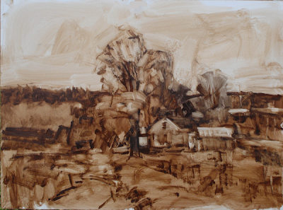
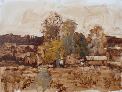
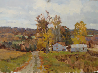
Here is a step by step of the painting I did today. Here I am continuing to work up the painting using umber and a little medium, manipulating it with a rag. It was pretty gray out so I was able to work almost all day on it. On real gray days the light doesn't change too much so I am able to work on it much longer than I could under the changing light of a sunny day. The panel I am working on is an 18" by 24" piece of oil primed hardboard.

I returned and set up at the location for the day.This painting was not made from the photo references you saw yesterday.

I have moved slightly forward of the point where I shot the photos I showed yesterday and I have followed my plan by removing the phone poles and making the road into a gravel rather than a blacktop road. That minimizes it in size and assertiveness both.

I worked up a pretty well thought out drawing , shoving things around until I had an arrangement that I was comfortable with. As always, at least for me, shoehorning the immensity of the scene onto the small canvas was the challenge. I also worried a lot about putting the house and tree unit into the landscape, rather than painting the house and tree unit, and then surrounding it with the landscape.

Above, I have continued to develop the painting adding color over my grisialle under painting. I worked that thinly and used Galkyd so it was pretty much dry. I put in a sky based on what was happening at the time that I thought looked good. I always give the sky a shot on location, but often I end up redoing the sky in the studio.

Here is the painting as I brought it home tonight. I wish I was able to tune the color of things in photoshop express a little better. When I am offered the ability to fool with the color I can adjust red, green and blue. I am sure there is a reason why I can't adjust red, blue, and Yellow, But that is the way I think. If any of you out there can tell me what the deal is with that, I would appreciate it.

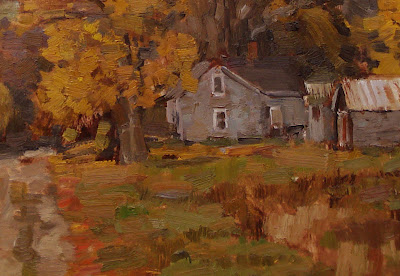
Below is a detail of the middle of the painting so you can see my brushwork.


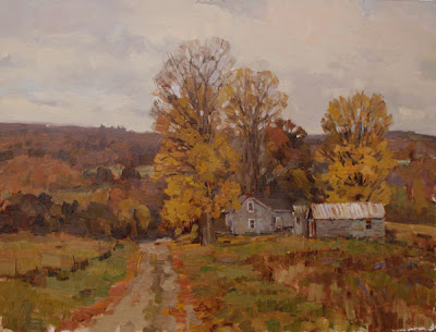
This painting is earmarked for the gallery of CNY in Cazenovia, New York. I will work it up a little in the studio, but I don't expect to do to much to it, as it has a nice rough and brushy feel to it now and I don't want to refine that out of it.

Thursday, October 15, 2009

Some editing


Here's a photo I took today. I love the fall. I like fall best when it is past its peak, then I see about half leaves and half dark branches. This year I have taken a lot of photos and although I seldom paint from photos I may make an exception or two this winter. The fall is so short and I really like the moody feeling of it and I like using the colors . I can subdue them a bit. That way my paintings are the color of 500 dollar suits!
Here is how I am thinking of the painting. I am going to lose the phone poles and I am going to change the road from blacktop to gravel. I think both detract from the scene, here's why. I like the romantic look I get by not indicating that it is in our current time. I think that allows the viewer more of an opportunity for a kind of wistful longing to be in the place. But that is a personal choice of mine. You might want to leave the telephone poles in. Even I could leave those on the left, in the painting as they aren't too assertive.

I would have taken the right hand pole out even if it had been a natural object, like a birch tree. It is jammed against the picture plane and attracts too much attention to itself, it looks so huge that close in. But it also does another thing, it doesn't seem like real vision, we don't see the same way a camera does. A camera sees everything with the same amount of clarity. A viewer looking at a painting which copies the photo might subconsciously feel they need to turn their head and refocus to see the pole, after they have looked at the house. We tend to read from left to right, or at least design that way traditionally, and so after you look at the house your attention then moves over to that pole. I would rather you looked at the house and then into the distance beyond it.
I changed the road for the same reason as above, it is more evocative to me if I make it look a little "old timey" some of you will find that too sentimental and that's fine. I am showing you how I do things more than how YOU should do things.
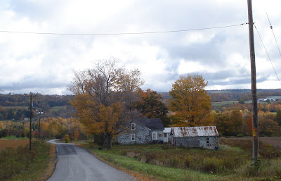
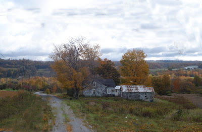
But there is another important reason I have removed both the telephone poles and the blacktop and that is this. Both are super hard edged. I know I don't want that. My road is softened into its surroundings with grass and leaves and other incursions that blur its edges. You could probably soften up the blacktop road with leaves strewn at its edges and leave it paved though.

I also reworked the sky a little bit, I felt I could improve on the shapes of the clouds and sky patterns up there. I made them more similar to the background, just a little. I like to do that sometimes, make them compliment each other.

Tomorrow I am gong to go out and give the thing a shot in paint if the weather holds, I am excited as it looks like it will make a pretty good painting. As I work on the thing I might find I need to change a lot of other things, but I will see what happens out there.

Wednesday, October 14, 2009

A little monster appears in a picture

Tonight I want to talk about another sort of thing that needs to be edited out. In this case it is what John Carlson calls a local freak in his book on landscape painting. That is the text for this class incidentally. A local freak is something that just happens to look weird. He gives the example of a cloud that looks like a fish.

Tonights "local freak" is a standing beaver=manatee hybrid, see him? Here he is below, circled.

This is a closeup of the little guy. This is the sort of thing that when seen by primitive man gave rise to the animistic religions.

If you are a photorealist or just copy exactly what you see you will dutifully transfer this beaver-manatee onto the canvas, and it will take over your whole painting. Here I have edited him out,
there that's better!

Ives Gammell, in his book Twilight of Painting spoke of "a fish in the wall paper that having been once perceived, would no more down than Banquos Ghost". You should look over your paintings carefully and edit out any thing that looks like a little face or a little figure, or a potato. There is another reason that you can't just paint what you see.


No Beavers or Manatees were harmed in the making of this post.