Saturday, May 26, 2012

If only I knew

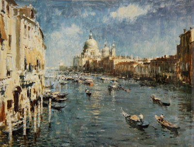
Frederick Mulhaupt 1871-1938, lived in and painted Gloucester, Massachusetts.

There are now over a thousand posts in this blog. When one writes a book, it is a reasonable assumption as you write page 342 that the reader has previously read page 40. But in a blog people just parachute in anywhere they damn well please. I get a lot of e-mail queries that I have answered before or written about a year or years ago (have I really been doing this for years?) it was to be a one year project, you know. Keep those questions coming, it's not a problem, I ignore some of them anyway, or snap off a quick return to  the interrogator alone. I get some questions that really help me to know what to write about and inform me when I have been aphotic when I want so to be limpid. Here is an example of a question like that resulting from my last post on premixing the color of your light.

Dear,  Mr. Stape

Does this premixed light color have white in it, or is it a color or mixture of colors without white?

Deb Pilatory

Yes of course it does. I should have said that. The premixed color should be mostly white in fact, The premixed color should be high key, like the light itself, real high key.

The blog started out with me explaining the most basic information about painting and studio knowledge. I progressed through ever more complex subjects like design, color, tree anatomy, the art business, framing, American painting, a woman giving birth to rabbits in Elizabethan England and the curious narrative of Dirk Van Assaerts. There is a whole lot back there and some of it is useful. If you have the time,  I urge you to explore the blog backwards, that is,  starting from its beginning and working forward. It should take you about six to eight weeks. There is no index. Even I have no idea what all is in those archives.

Antonio Cirino 1889-1983 Rockport, Massachusetts artist
Tonight's subject is  "If only I knew" For me painting is about half observation, and about half problem solving. I am always looking at my art (and yours) and asking "whats wrong with this thing, why isn't it working and how could it be made to? " 


THERE IS ALWAYS AN ANSWER TO EVERY PAINTING PROBLEM, EVEN THOUGH YOU MIGHT NOT KNOW IT.


I might not know that answer, but there is one. If Willard Metcalf, Rembrandt, or John Sargent were to sit in front of my canvas they could rapidly fix its' problems. So if I knew what they would have done, I might know at least one answer to the problem. Often there ARE several. Sometimes the answer can be found through  careful observation and analysis, but just as often the answer lies in invention, design, obfuscation or rearrangement of the elements of the view.

For me a painting is finished when I have solved all of its' problems. In old movies physicists worked on multiple blackboards stretched about the walls of a classroom, writing endless equations and mathematical claptrap until they reached that last blackboard and did finally solve the equation. This is the process that lead to the discovery of flubber .

When I don't know the answer to a problem in a painting I begin plugging in solutions, what if I soften it all up or subordinate this passage to that one? I try a change, and if it doesn't help I take it out with the side of my knife and try something else. I have stood in front of a painting (particularly seascapes) and tried solution after solution for WEEKS. There are thousands of decisions in a single painting.

A painting has to be pretty much all "right". The viewer won't tolerate much unconvincing drawing or unpleasant design flaws, nor will he waste much time on a painting that is merely accurate or ordinary. Folks are easily bored, at least the ones who spend real money on art. The more expensive the art gets the smarter the customers seem to become in the traditional painting world. Oddly, the opposite is true in the modern art world.

----------------------------------------------------------------------------------------------------

 If you would like to know about the upcoming July workshop in New Hampshire please
click Here. I have included the cost of the workshop and information on the location in the White Mountains. I can teach you a whole lot, and probably save you years of screwing around. Why torture yourself ? Don't get left behind! You are worth it! Everyone's doing it. Act now.

The workshop takes place at a historic, wooden 19th century Inn in the White mountains with a view that is astounding, and all we have to do is paint. I park my car and forget it for the whole time I am there. I knock myself out from breakfast till bedtime to make sure that the workshop is as intense and useful as I can possibly make it.

Wednesday, May 23, 2012

Premix the color of your light

Sanford Gifford, Kauterskill Clove
Light has color, as a landscape painter you need to identify what that color is (or what color you are going to use) in a painting. Often the light is warm and butter or honey colored ,late on a sunny day. But on a gray day it might be cool or even silvery. There are situations when the landscape is suffused with red light. It is very useful to mix the color that is in your light and have a pile of it on your palette. Most of the colors of objects in the light will be effected by it. You can feed this color into whatever the light is hitting. This is useful for two different reasons. One it saves you having to mix every color in the light from scratch. You can inject a mix of the local or apparent color of the object with your light mixture and get pretty close to its illuminated color. This saves a lot of mixing time on location and clearly communicates what is in the light an what is not. On a sunny day I am going to expect to mix a red and a yellow into a lot of white to make the color of the light. What red and which yellow can be adjusted depending on the look of the day and what you have on your palette.

Above is a painting by Sanford Gifford that is suffused with the color of the light. Her has pretty much used the color of his light to paint everything that takes light from the sky. If it turns towards the sun, it gets the yellow mixture into its' note.


Here is another Sanford Gifford with golden light. One of the things that routinely happens in nature is that the color of the shadow is, or at least contains, the complement of the color of the light. So a golden sunset will call for blue or violet shadows. If you have the color of your lights it is easy to come up with an opposite color to add to your shadows. The complement of the light will form a major part of your shadow note and can be fed into those to establish the shadow color.

When I paint outside I have a pile of paint that is the color of my lights, I use it for underpainting the sky to get light in that, and I use it to more easily and swiftly create the color of things in the light.

I don't really make a shadow color, but I am always aware of what it is. On a sunny day I like to feed cobalt violet into my shadows, so  that functions as a premixed shadow. I also like to throw ultramarine and burnt sienna at my shadows, by varying the mix of the two I can control my color temperature there. Burnt sienna is great for heating up shadows, particularly in their reflected lights. I like to heat up my deepest shadows. the darkest accents work best if they are fiery hot. Often I am installing this because I like the way it looks rather than because I have observed it.

Having a standard color laced into my lights tends to unify a painting. rather than a mosaic of unrelated colors the lights are "coded" through by a constant note. If something out in nature has an interesting color that doesn't conform to this system I am free to disregard my  systematized light. But generally the light does have a color and that influences every surface it hits and determines the shadow color too with its complement.

The Sanford Gifford above was painted using a systematic color for the light. This painting was no doubt done in a studio from a drawing made on location, or a painted sketch. He did not stand out in the field with that canvas matching the colors of a sunset. He invented it and imposed it onto his drawing. Gifford "fixed" a color for his light and used it through out his painting.He got a believable light effect and the painting is suffused with his light color that he has sown into the entire  tableau.

Saturday, May 19, 2012

Landscape painting is a lie, well told!

© The Estate of Edward Seago, courtesy of Portland Gallery www.portlandgallery.com


 I received this comment on the last post:

 This is interesting and a bit confusing to me...if you 'key' your painting, don't you risk losing that lovely, oh so lovely atmospheric sense, the 'lightness' of nature that is almost like 'dew' to behold? I understand it all depends on what the light effect is of the particular scene you are viewing, but still, the phrase 'key your painting' troubles me and makes me think that it is similar to making NATURE conform to something she is not....of course, I am talking from a stand point of almost zero experience....and how does this translate to indoor/ still life painting? Personally, I love the Boston Painters, whose work, while it definitely utilizes dark darks and flat shadows, always feels 'light' and that the light effect 'was just that'.

Exactly! I want to make nature conform to something it is not. I wish to make art. Nature is one thing. Art is another. Arts a lie! The root of the word is artifice. Here's the definition of that. "Clever or cunning devices or expedients, esp. as used to trick or deceive others: "artifice and outright fakery. You cannot "observe design, color or emotion into a landscape painting. All of these things are installed by the artist. Look at the wonderful Seago above, would you mistake it for a window? Is it truthful?

It is possible to set up a still life in the studio and carefully transfer its appearance onto a canvas, at least if you have controlled lighting. But landscape is a different game. For a number of reasons.
  •  Outside, nature is always changing. Every time you look up it is slightly different. There is no "thing" to copy exactly. You cannot set up outside and copy your way to a great landscape painting.

© The Estate of Edward Seago, courtesy of Portland Gallery www.portlandgallery.com

  • The landscape is a warehouse of more props and details than you could ever want. It is essential to select the important, and reject the unnecessary clutter. It is impossible to paint every leaf in a forest and still get every blade of grass at your feet and maintain any semblance of unity or grace.
  • You can paint exactly what is before you as carefully as you can, but I will eat  your lunch, EVERY TIME. Paintings carefully copied from nature before you are usually ordinary. Usually fine landscapes bring a treatment or a "take" on  the landscape that is individual to the artist. Their paintings look as if they could only have been made by that artist. Their paintings are personal, expressive and individual. Edgar Payne doesn't look like Corot or Constable, nature may be constant, but each of these different artists have made paintings that are distilled from the experience of nature rather than a precision reproduction of the actual scene in front of them.
  •  
© The Estate of Edward Seago, courtesy of Portland Gallery www.portlandgallery.com
  • The range of values outside exceeds our pigments range. The value of a painted sky is often too dark even if you use pure white. It is necessary sometimes to approximate the look of nature. A blue sky might be higher key than you can paint and still have any blue pigment in your note for instance. But most importantly, the 'look' of nature is secondary to the "look" of the painting. If the painting doesn't move the viewer, you can't assure them that it looks just like nature. Art is one thing, nature is another.
  • There is a historic "language" of landscape painting, and it is inventive. The greats have rearranged and riffed on nature to make their paintings. Landscape painting allows for lots of re arrangement and artifice. it is that quality that for me is what makes landscape so appealing. If you play it straight you will usually end up with matter of fact paintings. It is not what it is a picture of, but "how" it is a picture of, that is important in the landscape.
  • No one would mistake a Corot or an Inness for a window. They are created illusions based on nature but arranged and presented in a manner unique to their particular creator. Landscape painting is best when it approaches poetry and weakest when it is an accountant's laundry list of the objects that happened to be in front of the artist.
  •  
  •  
    © The Estate of Edward Seago, courtesy of Portland Gallery www.portlandgallery.com
  •  
  • Imagine an historical account of the battle of Gettysburg. A 100,000 page description including how every single soldier put on their shoes and explaining their genealogy and sartorial preferences with a complete accounting of their high school grades, and body mass index thrown in for good measure, would not be more informative than a description that seizes on the salient points of the battle and tells the story of a few men's experiences that typify the experiences of a great number of the participants. Selection and simplification are the bifurcated roots of design.
  • There is a big difference between a believable or a beautiful landscape, and a truthful one. A great landscape painting is more than truthful. A map is truthful, a painting is a construct, an artificial creation that recalls nature rather than records it faithfully. Art is a lie! well told, that says more than the truth.
  • I love the Boston school too, my roots are there. But, the Boston school painters were largely studio painters. They painted figures and interiors and still lives. Except for Bunker, ( oh yeah, and Enneking!) I can think of few who really concentrated on the landscape. This is true of the current generation as well. Landscape painting is a peculiar and different discipline than studio figure painting. The New York and Old Lyme painters, like Hassam, Metcalf and others were more serious about the landscape. For most of the Boston school landscape was a sideline or the background for figures. Aldro Hibbard was a student of Tarbell and the other Boston School painters of the previous generation to his own, he was a landscape painter, was he still Boston school? Maybe, maybe not.....Kaula, a lesser known Boston painter did a lot of landscapes, Benson did a few, but he would be forgotten today if his pure landscape was all that he had produced. There is (in my opinion) not a particularly strong landscape tradition within the Boston school and most of it's great practitioners were figure painters and not landscapists. I bet I made a lot of enemies tonight.

Friday, May 18, 2012

A little dab'l doo ya!

Emile Gruppe

 A reader asked me this question;

  I have never used lead white. But titanium white to me is the color killer. I cannot get over how much it dulls and cools colors. Even the tiniest amounts sap the life from the color mixture you are working on. Since we are talking about palettes, do you have any instruction on color lightening while avoiding the neutralizing power of titanium white?

There's an interesting question. I have written about this before and somewhere back in the over 1000 posts behind this one lies pretty much what I am about to say now.

EVERY DROP OF WHITE YOU USE IS A DROP OF COLOR YOU DON'T USE.


 White will kill your color, make it chalky or vapid. Titanium white is very opaque and it will eat your color if used in excess. What I mean by that is it will overpower your colored pigments because it is so opaque. But still I think it is the best solution for 99% of the painters out there. But here are the alternatives.

  • Zinc white, the Emile Gruppe above was painted with zinc white, Gruppe and zinc's other adherents liked it because it didn't eat up their color so much., It is much more transparent than the titanium, weaker. BUT be warned, there is a major question about the permanence of Zinc white. It makes a brittle paint film and recent thought seems to have turned decisively against its use. If you are going to use zinc white you may have permanency problems.
  • Flake or lead white is less opaque than titanium also. It handles beautifully, looks good on the canvas and dries quickly. It has everything going for it except one thing. It is poisonous. I don't recommend that anyone other than  hardcore professionals use it. It is not appropriate for amateurs. Unless you paint pretty well you won't see a big benefit from its use, and will needlessly expose yourself to lead. It is a good idea to wear gloves when working with lead white, never eat or smoke when working with it and never spray it or sand it. Aerosolized lead is a dangerous thing. Don't breathe lead.
I think as I said before, that titanium is the right white for most painters. This One is the whitest thing imaginable, nothing else is like it. 

If you paint darker, that is, you key your paintings down little you will have deeper richer color. Just as transposing a melody down an octave on the piano gives a richer sound, keying down a painting gives richer color. You can make your paintings with color almost straight from the tube if you keep the key of your paining a little bit low. The answer is to use less  white.

An old, and very skillful  artist told me about twenty five years ago "make nature look like your palette" I thought that was really strange for a while. I had worked so hard to learn to "hit" the color of nature in the value s that it presented itself in front of me. What he meant was to voice nature in values  that were more like those of the pigments sitting on your palette unalloyed.

I have known a painter or two who have substituted Naples yellow for their white and used that in its place. I never thought that worked so well, to fold a soft yellow into the entire painting. it gave a "look," that while OK in a single panting would be oppressive in a roomful of them. Tricks are like that, they frequently take away more than they give. Naples, real Naples is a lead paint too, like flake. So it is poisonous. However, most Naples today is a mixture of titanium white, yellow ocher and some cadmium ( or cheaper substitute like arylide) yellow. These Naples are not labeled hues for some reason. Remember, a hue is a mixture of colors that imitates the real thing. The Naples hues have none of the lovely softness of the real Naples. They are strident and a bit acidic.You can tell a real Naples because the tube is very heavy, like lead.

Lastly, passages that are transparent, contain no white. That's what transparent means in painting practice, non white in there! The white of the grounds shows through the paint to keep it light in appearance.. The paint itself is only a thin film. You can bet the white problem and paint some very high key notes anyway by working transparently on a white ground.

I think the best strategy is to paint with less white but still use titanium. It s the best nontoxic permanent white. Titanium is inexpensive and made in lots of different styles by different makers. If you go easy on it you will have fine color.

Thursday, May 17, 2012

Easel-tweak!


 I had to buy yet another French easel this year. I have owned over 1400 of them now. My first was the best made, it was a Julian and I bought it in about 1975. I painted outdoors on French easels for many years until switching to the Gloucester easel. I used to kill a French easel every season in my Rockport period. The wind did most of them in. The easel would start to "sail" and I would hold it down and then  put a rock in the back of the box. You know, in those tray shaped compartments amidships for brushes and stuff.

If the easel lifted off again I would add a bigger rock, or maybe two. I was working on the coast a lot, and there was plenty of both wind and rocks. Sometimes, however, even though I had lots of rocks in the back of the easel it managed to lift into the air and hover briefly above the ground. Then the when the wind dies a little and  the easel crashes down with its stone driven load on those little skinny Bambi legs, splintering it's femurs. So I have bought a bunch of French easels from different manufacturers with varying quality.


I have bought half box easels, the smaller French easels that are too narrow. But the folding palette baffles me. How do you keep the paint from running through the crack right through the middle of the palette? I need more carry space than that anyway.

I bought the Soltek. I took it on a painting trip to Paris, they were new then and nobody there had ever seen one. It looked like the lunar lander. I set it up on the street in Mont-martre , and all of the Eastern European street artists had to come and examine it. It works pretty well, but I had a leg freeze up because of sand, I believe, entering it's sensitive inner mechanical elements and confounding them.

I tried a Gloucester easel about once and  have used it outside ever since. At least unless I must travel on an airplane (and sometimes even then) or set up in very crowded places. In a crowded city a big Gloucester easel becomes a traffic hazard and dorks always trip over it's legs. Inside, the Gloucester easel is just way too big, and it's feet with their little steel spikes, slide on the floor rather than pierce it's surface. I use mine inside for demonstrations but it is not ideal for an inside easel. So I use French easels too.

 I have seen and examined dozens, probably hundreds of easels belonging to students at my workshops and have seen a lot of easel problems. I have seen easels so badly made they almost cant be made to stand up reliably. And they all shimmied and wiggled when I painted on them. The French easel design has a weakness. An Achilles heel. The metal hinge between the upright standing "easel" part that holds the painting, and the box part where the drawer lives. These two flat pieces of metal are held with screws or sometimes rivets into the sides of the easel carcase where it is thin and delicate. They inevitable strip their screw holes and then the whole upper easel is no longer a stable platform on which to paint. You want an easel to be stable, no flopping around, that is very bad. I dislike pochade (pronounced "pochade" ) boxes because they are not stable. or at least mine never are.

This time I bought the Mabef easel. It got good reviews on  various blogs and forums and I wanted to get the best quality easel I could. You can get a french easel for the price of a good belt at discount shopping warehouses now. But they are not well enough made to withstand the abuse of day in day out use. If you just want to just talk about painting, they would be fine. I like the easel, it is well constructed, and the hardware is precisely made. But the little tweak they have given the traditional design is what I want to show you. Those of you with French easels know that the back leg (that leg which is alone out there and furthest away from you) folds back at a hinge articulating it's middle, like a knee. This collapsed leg then folds up into a slot along the bottom of the easel.On the Mabef easel the rear leg is attached to the side of the box, just like it's two front legs, rather than springing from its undercarriage or loins.


I photo-shopped the picture above to remove the handle so you can see this little assembly. The reason this is good is that it means that all of the legs sporing from the easel at the same level, or distance from the ground. This is important when you want to use the easel sitting down, something I am likely to do when traveling. The other French easels I have owned didn't do this very well. When they kneeled that back leg was a slightly different height than the rest, and it was difficult to get the box to sit level. The Mabef bracket above solves that problem.

So I am recommending the Mabef easel. It is not one of the less expensive easels, actually it is one of the most expensive French easels,  but it seems to be of excellent quality and is thought fully designed.

Sunday, May 13, 2012

more palette talk

I was asked about the arrangement of my palette. In particular, a reader wanted to know whether I had the warm colors across the top and the cools on the side. I don't.

Mt palette is arranged a little like a QWERTY keyboard. That is, I have the colors I use a lot arranged near the white at the upper left hand corner of the palette. I also have my blues spaced across the palette from one another because I tend to mix them up when I am working quickly. Colors that I use the least are on the ends. Ivory black is on one side and cobalt violet is on the left, the violet is expensive and this makes me husband it.

I have the ultramarine and the viridian together and the cadmiums are just across the palette. That way, I can bring them both out to meet in front of my white. An awful lot of the colors I need in a landscape come out of that pile.

Changing one pigment on your palette often means that other colors need to be adjusted. There are so  many palettes you might think it is arbitrary, but there are "types" of palettes as I mentioned the other night. If, for instance, you add a pthalo blue to your palette you are probably going to want to add lots of cadmiums to step on it, or tone it down. You will need them, pthalo is strong stuff,

A reader mentioned using transparent red oxide instead of the burnt sienna. Richard Schmid seems to be the top exponent of  transparent red oxide, which is more transparent than the sienna (and more expensive.) I am not sure why an iron oxide should be expensive but it is. I believe it has to be milled carefully to get the small particle size that makes it transparent. When I have transparent oxide instead of sienna, I find I still want the burnt sienna. The two are too much alike to stock both, so I added a redder yellow...Indian red in my case. It is still in the family but redder. I think Schmid probably chose to add terra rosa because of this. Like Indian red, it is in the earth red family but redder than burnt sienna.

I guess I have to have viridian. I am never quite happy mixing all my greens from my blues. I do that a lot, but I still like to have the viridian. It makes a lot of greens, but it also means I don't need a cerulean. I used to carry a cerulean blue. It was very expensive and I have found that I can fake it with the viridian.

I am sorry for the rushed quality of these posts, I am traveling and using the wireless in a MacDonalds. I will be posting from home next so soon they will stretch out a bit.

---------------------------------------------------------------------------------------------------------
If you would like to know about the upcoming July workshop in New Hampshire please
click Here. I have included the cost of the workshop and information on the location in the White Mountains.

Saturday, May 12, 2012

Plein air palettes.


My discussion of additions to a three color palette prompted several readers to post their palettes. I thought I would post mine as long as we art discussing them. Mine is actually a little on the large side. h
Here it is:

Titanium or lead white 

cadmium lemon yellow
cadmium yellow
yellow ocher

cadmium red light
quinacridone red or permanent alizirin
burnt sienna

ultramarine blue
cobalt blue or Prussian blue
cobalt violet

viridian
 ivory black

I have a warm and a cool of each hue, I have a yellow and a red earthcolor. I have viridian which helps making all those greens and I use the prussian for that too. And I have black, I could probably live without that and often do, and lastly I have cobalt violet my favorite landscape color. I draw with it and use it for lay-ins and it is great to modify greens and make shadows. I use the Gamblin, it seems like it is reasonably priced for its quality. I also carry a premixed color of my own  I call pornstar pink that I use to feed red into my greens and skies.


Zan Barrage submitted asomewhat smaller more straightforward palette ;
the permanent rose is quinacridone, of course.

How about a cool and warm of the three main hues?
Cdm Yellow Light
Cdm Lemon

Perm. Rose
Cdm Red Light

Cobalt Blue
Alt. Blue

+
A couple of earth colours


Jeff contributed Sorollas palette. Gee thats almost the same as mine, less an earth color or two , this is a more chromatic or pure colored palette.

cobalt violet,
rose madder,
all the cadmium reds,
cadmium orange,
all the cadmium yellows,
yellow ochre,
chrome green (since replaced by permanent green light),
viridian,
Prussian blue,
cobalt blue
French ultramarine.
In both cases, he used lead white

I will be back and expound on palettes some more gotta hurry tonight!

----------------------------------------------------------------------------------------------------------

If you would like to know about the upcoming July workshop in New Hampshire please
click Here. I have included the cost of the workshop and information on the location in the White Mountains.

Thursday, May 10, 2012

Plein air idea 12

Tonight I am going to talk about what you need on your palette and how one might expand a small palette. Many painters today work with three color palettes. It has become very popular over the last ten years or so to work with a small palette comprised of ultramarine, permanent alizirin and cadmium yellow.This palette is an excellent way to learn to make color notes and it gives a unity to your color. Almost every note has a smidge of one or both of the other two colors. But there are some drawbacks too. There are a lot of colors in nature than you cannot hit with this palette, and it is hard to vary your color temperature without a hot and a cool version of each hue. If you wanted to enlarge your palette from the three listed before, how might you do it?

Well, there are a couple of answers to this. It depends on which way you want your paintings to go, bright and "modern" looking , somewhat restrained and historic, or the "full old master". The first palette expansion would push your color to greater brightness...it is basically a Gruppe palette. To our three color palette we make a few exchanges, We lose the ultramarine and add pthalo or Prussian blue. Then you add a couple of cadmiums, maybe three or four if you like, your cadmium section of the palette could contain cadmium yellow lemon, cadmium yellow medium, cadmium red light, and cadmium red medium. To the three color palette you have added a string of the entire range of cadmium hues. The pthalo is fed into the various cadmiums to produce a lot of varying notes in nature. The pthalo and the cadmiums together have lots of punch and the light passages can be very colored, the pthalo can also serves as the root for some rich violets. This palette usually gives a more contemporary and clear colored look. You can mix the earth tones off this palette and they have rich variations in them, as their mixtures are varied.

The second suggestion, and where I usually hang out, is the more traditional palette. That would take the original three color palette and add a few earth colors, burnt sienna and yellow ocher. These are grayer and "dirtier" than the cadmiums but they are very useful in getting the colors of nature which tend to be a little grayed out anyway. A second blue, perhaps cobalt, and  viridian green would expand your ability to make nature's colors. The burnt sienna fed into shadows gives a nice complement to the lights and the warm shadows give a more traditional look than the strong violet shadows of a rawer impressionist look.The cobalt and the viridian are nice to have when painting skies. Of course the viridian is a good precursor of many common greens in sunlight.

 The third option that comes to mind is the "full old master". To our three color palette, we add black, yellow ocher and an earth red like Indian red and maybe the viridian. This gives a more serious and restrained color. Seago painted with such a palette. I like to trot out this palette for moody things and gray days. It enlivens a grouping of paintings or a show to have a few pictures painted with a graver palette. This palette too installs a color unity almost automatically. You will find your paintings are more formal and many pleasing color schemes can be had that use grays, russets, dull ochers etc. You can make paintings the color of 500 dollar suits. A great many people like to select paintings in this kind of color for their homes. And Wyeth painted in tones that this palette produces well. Like the limited palette, though, there are a lot of colors that you cannot hit with this palette. That is good in that your painting will have color unity, but bad if you want to get the true observed color of things.
-----------------------------------------------------------------------------------------------

 If you would like to know about the upcoming July workshop in New Hampshire please
click Here. I have included the cost of the workshop and information on the location in the White Mountains.


Plein air ideas 11

Tonight I will talk a little about color and landscape painting. I meet a lot of students and tyros who want to learn to work in color rather than in drawing. They believe they can "specialize" in color and avoid learning drawing, as it interests them less. But color needs a scaffold beneath it .Well, in landscape painting or figurative art anyway. There were color field abstract painters who did no drawing and of course, Pollack, but in traditional figurative painting that seems to be the deal, because:

COLOR IS A DECORATION YOU HANG ON YOUR DRAWING!

Here are some bullet points regarding color in the landscape:

  • Favor value over color. Value is a part of drawing. If you get the value right you can "inject" the color into that.
  • It is better to overstate your colors and then temper them with their opposites than to try to push color into an under-colored passage. The first gives a more complex color. The color that you toned down is still there percolating through the note (I know someone is going to ask me about that, I have written on complex and inominate colors before in this near 1000-entry blog. It is searchable.)
  • Color can express turning form through space. The volumes and planes of an object can be expressed using varied color.
  • All color is no color! In order for a color to really look strong or its brightest, it is necessary to contrast it against a desaturated or grave color. A painting without any grayed or subordinated color is not going to be more colorful than one that has those grave notes.The graver notes "activate" the highly colored ones.
  • Try not to make a mosaic of unrelated color...the colors in a painting are related to one another like the notes in a song. There are harmonies, chords etc. There are also discordant arrangements that make the viewer's teeth hurt.
  • Control the temperature of your colors. If you paint your lights warm, your shadows will probably be cool. If you paint your lights cool, your shadows will probably be warm. The juxtaposition of hot and cool notes gives exciting vivacity! 
  • Out there in the working week, on location nature is generally in grayed or toned down notes, with occasional flashes of clear bright color. Unless your painting is at least a little bit grave, your flash of clear bright color will not "tell" against it.
  • Envelope is the color imparted to an entire scene by the lighting. It is a note that is sown throughout the entire painting. Tonalism is an exaggerated form of envelope. Envelope can be the glue that holds a picture's color together and thereby avoids the dreaded "mosaic" of unrelated color.
  • Three color palettes are fun, and a great way to learn color mixing. On the other hand, you don't get good control over your color temperature. There are a lot of notes before you that you must approximate rather than "hit" using a severely limited palette. Ultramarine, permanent alizirin and cadmium yellow light make a basic three color palette.
  • I find yellow ocher and burnt sienna to be essential when painting outside. An awful lot of the notes I see (or want) are made from or tainted with the dirtier earth colors.
  • Beautiful color is beautifully arranged and stated color. That is not the same thing as the greatest possible amount of chroma, anymore than the greatest volume is a factor in the quality of music. A lot of things about painting are more complex than you would expect going into it.
If you would like to know about the upcoming July workshop in New Hampshire please
click Here. I have included the cost of the workshop and information on the location in the White Mountains.

Wednesday, May 9, 2012

Plein air idea 10


I got a comment the other day asking me to better explain what I meant by the word "footlights". I used it in passing to describe the foreground of a painting. One of the great temptations when painting outside is to show everything from your toenails to the zenith. But it often causes a problem for the viewer. Below is a quote from a post in the archives. You can read the entire thing  Here

"If we only had our eyes set one above the other in our heads, we could see the picture at a glance. But since our eyes are paired side by side we must "lift" our eyes to travel from the foreground to the middle and background assembly area. This unpleasant 'lifting" of our eyes bothers our attention spans, and in that brief unconnected synaptic instant in which we are transferring our vision upward to the middle ground and beyond, our whole concentration is lost!"

We generally focus our vision in a narrower band than that, across the center of a view. If the painting makes the viewer feel like they have to move their head to view it you will probably lose them. It is better to begin your paintings foreground  further away from your feet. Just as in the theater the play doesn't begin in the row ahead of you, it happens fifteen rows away from you and it begins with the footlights at the edge of the stage. It is almost always more effective to place those footlights a good stones throw into the view before you.

There is another advantage to doing this too. Al of that close up detail is much more difficult to handle, the really close stuff in a painting can be assertive with its bristling curlicues and pork rind excrescences. The whole bottom third of your painting might get filled with writhing baroque detail overwhelming the viewer on his way through to reach the middle ground where the action takes place.

LOTS OF PAINTERS HAVE REDUCED THEIR FOREGROUNDS TO BROAD OPEN AREAS WITH A MINIMUM OF DETAIL.THE VIEWER EASILY TRAVELS THROUGH THE SIMPLIFIED VESTIBULE OF THE PAINTING ON HIS WAY TO THE INTERIOR.
----------------------------------------------------------------------------------

If you would like to know about the upcoming July workshop in New Hampshire would you please
click Here. I have included the cost of the workshop and information on the location in the White Mountains.

Tuesday, May 8, 2012

Plein air ideas 9

I have taught plein air painting off and on for twenty five years , maybe more. I forget. Over the years, and particularly recently, I have noticed I am teaching the same things over and over. There are a handful of faults that I see every time I teach. Let me load some bullets into my clip and here they are;
  • The painting is in all middle values with the contrasts so suppressed that the painting has no punch.
  • The values of the lights are confused with the values of the shadows. The lights are not consistently brighter than the shadows.
  • No attention paid to color temperature. The picture is executed with no regard for which notes are hot and which are cool. This is particularly true with painters using three color palettes, which don't lend themselves to the expression of color temperature.
  • Drawing is haphazard or done without much care or delicacy.Often this happens to painters who value velocity or brushwork over drawing. Usually painters with studio backgrounds, or better still, atelier training seem to have a better grasp of drawing the landscape.This is a failure to look very closely at the landscape.
  • Designs that are overly symmetrical or too"stock" usually that means big tree on the left balanced by a field on the right. 
  • An uncomfortable closeness to the nearest objects in the painting. The footlights are set in to close. They are painting everything from their toenails to the zenith.
  • A line which seizes the viewer in the foreground and directs them into a collision with the side of the frame rather than into and through the picture
  • An underpainting in a hideous and assertive color that poisons every note laid on top of it. This is usually explained as something a previous teacher ( who was REALLY good!) had insisted was the only way to do things.
  • every color in the painting is as bright and saturated as it can possibly be painted. A lullaby played on kettledrums and air raid sirens.
  • A cursory "that's good enough" effort without a real intent to create something special. The painting is banged out in a short period of time and without much reference to nature or an attempt to design or bring anything personal or original to the presentation.Usually this is cured by developing an awe for the wonderful work of some deceased artist who becomes a yardstick against whom the fledgling tyro can compare themselves.
-----------------------------------------------------------------------------------------------
I am going to be teaching a workshop this july in New Hampshire. Check it out here.

Sunday, May 6, 2012

Plein air, idea 8


Levitan


You should establish your key early in the lay-in. "Keying" a painting means deciding where on the value scale your lights and darks will fall. A painting might run from an inky dark to a brilliant light, or the whole painting might be high key, that is, few or no darks. The whole painting takes place at the top of the value scale. A low key painting contains only lower (darker) values and few light ones. How a painting is keyed is your choice. You can choose to match the notes of nature in front of your easel or you can transpose  up or down to a higher or lower key.  Often a painter keys a landscape by spotting a few of the darkest darks and the lightest lights. Where the horizon meets the sky is a big contrast and if recorded early will set up the key for a painting.Your key might include only the top end of the value scale, the middle or the bottom or the entire range of values.

The painting above is in a low key. The darks are strong and rich and the values of the water and sky are only high in comparison to those darks. If you isolated a spot from the water or sky on a white field they would be surprisingly dark.

John Singer Sargent
  Above is a painting in a very high key. Almost every note is mixed with white and there are few darks, only enough to set off the bright notes. Often the key is strongly suggested by nature as it must have been for the Sargent above. But the artist can choose to key the picture his own way if he wants to.

A high key gives a look of brilliant light and an ethereal shimmering feminine quality. A low key gives a look of power and drama and a masculine quality. In a high key painting the color notes lose a lot of their chroma because they are so mixed with white. High key paintings are probably more saleable. The old masters generally painted in a low key .

 In a low key painting the notes are full of rich color as there is more colored pigment in each note than white. Just as transposing a tune down an octave on the piano gives it more richness and color, transposing  a passage in color down an octave gives a richer deeper color.

If you paint on a dark ground you will often inadvertently end up with a lower key. Painting in a high key is a lot easier on a white canvas. When high key color is weak it is chalky. When low key color is weak it is murky and "too dark".

Of course a painting can also run the gamut, that is, it can be keyed not to a section of the value scale, but to the entire value scale and have all of the values from ink to pure white on the canvas. That is probably the most common key in practice. You get a lot of those on sunny days. It is nice to know how to raise the key of a painting a little when you are out on a gray or dark day. Keying up a rainy day or gray day picture can save it from being lugubrious.

workshops for sale


 Fall Color Workshop  September 8th through 10th


 This is the Sunset Hill Inn in Franconia, New Hampshire. I have been teaching workshops there for about three years and it is the ideal location.  Because I have taught so many workshops there the inn keepers have learned what painters at a workshop need and they are now practiced at hosting my workshops and making sure we have what we need to operate without any distractions or responsibilities other than painting.There is a broad rear porch that overlooks the mountains so we can still paint outside no matter what the weather does. The lower level of the inn  is ours to store our paints and canvas so we don't have to haul it all to our rooms and it makes a good place to teach too. The view of the mountains is spectacular and in the fall it will be even better. The inn takes good care of us. We have our own private dining room too. They handle  our meals and even bring us lunch so  we can work all day uninterrupted. The inn is one of those big old historic affairs from the 19th century and is homey and informal. Most of the rooms have gas fireplaces, and it is cool in the evenings up in the mountains in the fall, so that is nice after a day outside. It is nessasary to stay in the inn to take the workshop.

 This will be the first fall workshop I have done there and I am thrilled. I love teaching workshops anyway. Everyone is always excited to be there and hang out with the other artists. It is like a three day party. We go from breakfast until bedtime. This is a total immersion program and I run the class about 12 hours a  day. I do an evening lecture while we wait for dinner to be served.The fall color in the White Mountains is legendary and people come from all over the world to see it. In the 19th century all of the great Hudson River painters made a point of being there too, just a few miles up the road from the inn. We don't need to leave the grounds of the inn  to find great subject matter so their is no problem with hauling easels around or caravanning cars to daily locations. We just walk out the back door and the whole Presidential range is spread out before us.

The schedule includes;
  • a demo every morning, on the first day I explain the palette and the various pigments.
  • In the afternoon the students paint and I run from easel to easel doing individual instruction and try to diagnose each students particular barriers to better painting.
  •  after the demo each day I run  a series of exercises  teaching root skills like creating vibrating color and the parts of the light (that is what you need to know to establish light in a painting) I am going to add a new exercise this time on color mixing.
  • I do a presentation before dinner with images from my laptop. One is a history of White Mountain art so you can see what the greats of American painting did with the same landscape we will be painting during the day. The other is unpacking out  the design ideas in the works of great landscape painters, particularly Edward Seago and Aldro Hibbard, two favorite artists of mine.


If you have never seen autumn in New England this is your chance to paint the most spectacular fall color in America. The cost of the workshop is 300 dollars, I charge a 150 deposit up front when you register. In return for that I will hold your place in the class. I wont give away your place to anyone else, so I don't return deposits. If you don't intend to come, don't sign up!


It is necessary that you stay in the inn for the workshop. The workshop is a collaboration between me and the inn. They provide a special reduced rate for the workshop participants. In the past several people have asked if they could stay with their brother in law or mistress who live nearby. If you want to do that, it's OK but you will have to pay a flat fee of 150 dollars to the inn for the use of their facilities. That fee will include your breakfasts, lunches and one dinner.Here is their web address:
http://www.sunsethillhouse.com/


Sunset Hill House
231 Sunset Hill Road
Sugar Hill, NH 03586
603-823-5522

Saturday, May 5, 2012

Plein air idea 7

Tonight's idea is this. Drawing in the landscape is often about sorting. We sort the spots and shapes in front of us into two piles,  THE LIGHTS AND THE DARKS.  Every time we make a mark on the canvas that represents something in front of us, we sort it into one pile or the other. Just like sorting the laundry. This thing is dark, this one is light. Everything goes into one of those two piles, the lights or the darks.

THERE IS NO OTHER PILE. EVERYTHING EITHER GOES IN THE LIGHT PILE, OR IT GOES IN THE DARK PILE. THERE IS NO "MAYBE" PILE.


 Every time your brush touches the canvas you must know absolutely what pile the note goes in.


A painting is best when either the lights or the darks are dominant. That is, the painting has discernibly more area that is dark than is light, or it has more light area than dark. An equal balance of the two is static looking.  A relatively small number of large shapes makes the best painting because a simple design carries better than a fragment complex one. 


To reduce the number of separate shapes, it is good to link your darks together when you can. A simple arrangement of a few darks and a few lights in an artistically unequal arrangement is the best start for a successful painting. If you don't have a strong simple arrangement, it is best to wipe out your start and try again. Without the foundation of a sound and attractive design, you can add detail and finish all you want and your painting will never be first rate. A strong design and a simple effective pattern of lights and darks should be the goal of your lay-in.


Once you have established that pattern of lights and darks, hold to it. As the light changes, our pattern remains pretty much the same. Don't follow the light, not unless it does something really interesting later in the day, but then only that change and then leave it alone.The forbearance and discipline to leave your original statement rather than changing it all day long takes practice. But if you don't learn this, your painting will crawl across your canvas as the light changes and you will be chasing a  will-o-the- wisp that you can never catch...until suddenly the sun drops behind the trees and you are startled, confused and defeated.

Friday, May 4, 2012

Plein air painting idea 6

Tonight's idea is that you can work outside longer on a painting than most people think. I am often asked "How can you paint a scene when the light is changing so rapidly?" Bullets please.
  • Gray days don't change very much, you can paint all day sometimes. I used to prefer sunny days and I guess I still do, but that constant light on a gray day does have an advantage.
  • .When I set up, I spend the first hour or so drawing in transparent paint. I work out my design, hunt down possible gremlins and get the tricky drawing parts understood, usually in a monotone. I have been known to do this for an entire session, and then come back a second day and work in color over a full finished monochrome painting from the day before.
  • After that hour I will work for about two hours in full color, the light changes over a two hour period but not THAT much usually. That is the "primetime" part of the session. I push myself to work quickly and efficiently. I am careful not to get hung up working and reworking a single passage, that is easy to do. Hopefully I spotted all of my gremlins in the first hour's lay-in stage and am not confronted with a passage that slows me down. I make a point of working all over the canvas and trying to keep the entire painting marching along as a whole.
  • After your two hour primetime, you can still work another hour or two by concentrating on the things that the light has not changed. For instance, the things that were in the shadow may still look the same. I have a record on my canvas of what the scene looked like before the light changed, and if I follow that I can still feed information into the painting so long as I don't rearrange my pattern of lights and darks. I don't want to "follow" the light as it changes..
  • Try to put your shadow shapes down and leave them alone. Don't keep going back and lengthening them over the course of your session. If they really look better later in the day, by all means change them, but don't chase them all day long on autopilot. THINK about what you are doing.
  • I have no problem returning to a painting a second or sometimes a third day. I wouldn't go back out on a sunny day picture on a gray day, but if it is sunny again, I like getting a second day, particularly on a 24 by 30. There is no law that says a painting has to be done in one shot. Monet didn't do that, and his pictures were OK.
  • Lastly and MOST IMPORTANTLY
IF YOU HAVE A STRONG PREVISUALIZATION OF WHAT THE PAINTING SHOULD LOOK LIKE, YOU WORK FROM THAT AND ARE NOT ENSLAVED TO THE CHANGING APPEARANCE OF NATURE BEFORE YOU.

If you are slavishly copying nature before you, when the light changes you must either change your picture with it, or go home. If you are making a picture, and you have an idea of what it should look like, then you will be far better able to deal with the changing light. 

Thursday, May 3, 2012

Plein air idea 5

Emile Gruppe


Tonight's idea is plot your large abstract design and impose the drawing from nature on that. 

If you are in the early stages of learning to paint the landscape, I think you should paint as closely what you see as you can. That is the root skill. You have to be able to reproduce whatever scene is before you, dispassionately and accurately.When you have learned to do that, the next step is to learn to impose a geometric order beneath the surface of representation and detail. There is an abstract painting beneath a good landscape painting. The painting is a set of lines and colors that set one another off. It is an arrangement of varied shapes with rhythm and movement.


TRY TO CREATE A PATTERN OF INTERESTING SHAPES.  PRESENTATION IS MORE VALUABLE THAN INFORMATION. THE ART LIVES IN THE PRESENTATION AND NOT IN THE NARRATION OF THE  PARTICULARS OF THE STUFF OUT IN FRONT OF YOUR EASEL.


In order to get this to happen I would remind you of last night's post on pixel size. If you lay the design in using large chunks or shapes, those can be manipulated to relate in a beautiful way with one another. They might be linked into chains of attractive shapes. They might be balanced across the picture plane from one another, or they could be strung across the middle of the painting like a string of pearls.

There must be infinite groupings of large shapes that are possible. Nature before you will suggest the main masses, but the abstract geometry is something you install into those shapes you have first recorded. A little extra time spent perfecting those big abstract shapes now is likely to make or break your painting. It is easy to make a strong design look good with a minimum of "finishing" but a poor design can be tricked up or have detail pasted all over it and still not really make a pleasing painting. It is the subterranean geometry hidden just behind the facade of realism that makes a painting work.

Once you have the big design in a few masses worked out you can install all the drawing you feel you need from nature onto this armature. In a landscape you can push things around a lot.You can bend things to fit onto your abstract design. A tree can just as easily be a little further to the left or a house can be further away, etc. The real elements of the picture can be subordinated to the abstract arrangement without the viewer being aware that you have done so.

The abstract arrangement IS the painting. Try to value the design over the representation. This will help you to make artful interesting pictures rather than matter of fact descriptions of the scene before you. Aim for poetry, not journalism. There are plenty of accurate paintings out there, not so many well designed ones. The longer I paint the more it is about design.


Wednesday, May 2, 2012

Plein air, idea 4

Idea number 4 is controlling your pixel size. You can grab that big brush and make your picture out of larger pixels!  I could call them  brushmarks or sense units, they are bricks you are using to construct your lay in. If you are laying in your canvas with a large brush it is possible to make only large generalized marks representing nature. If those marks are all .......say,  the same size as a walnut, you would be working in walnut sized chunks.

If  you were working like Willard Metcalf, that is in small rice-like strokes, you would have thousands of strokes on your over-the-sofa sized oil. If  you are making a brushstroke the size of a walnut, that number might drop to a couple hundred or so. That sounds like a lot of pixels still, but it is a manageable amount of decisions over a fairly short period of time. Little tiny marks make for a slower lay in. It slows you way down when you have to corral  ten thousand little marks instead of a few hundred.

This is plein air, the clock is running, and it is nice to make a painting in one shot if you can. When I lay in a canvas I try to make no marks smaller than a walnut. I make bigger marks than that, maybe, but not smaller. I would do this over a simple line drawing in very thin, transparent paint, roughing out the largest elements of the picture and having a rhythmic flow. I, personally, do not want to be arrhythmic. Once I looked at whole show of my paintings and realized "Oh NO! they are arrhythmic!" I  have since tried to make sure my paintings had some rhythm or flow to them.. I see a lot of arrhythmic pictures out there. Looks "square".

Imagine these pixels or marks, as tiles, ordinary tile like you put on a wall. You mix those tiles up on your palette, out of paint, and then lay them onto that over-the-sofa sized oil. It would also be handy to mix up a pile or two of colors which recur frequently in that rank of two hundred walnut sized pixels.

If I lay tile onto my canvas in big pieces, often I am doing this in transparent or monotone. I like to keep lay ins thin, I often have to push a painting around a bit at first to get it to work. As I said last night, white is a problem if you plan on making any errors.

I should add that if you are painting five by sevens, this doesn't really apply to you. I guess I am speaking of working much larger, as I do as a matter of course.You can use a larger brush and apply the same technology, but my experience has been that that this works better on a larger canvas.

The beauty of this "big chunk" lay in is that it keeps your picture "big". You are painting "broadly". It is hard to get hung up in any detail when you are using a number 10 flat and making chunks the size of calling cards. Can you cover an over-the-sofa sized oil with only a hundred strokes? You could work in hamburger sized chunks! You might cover the whole canvas with forty of them. Forty good decisions and there is your painting, on the canvas, wanting only for refinement, with a smaller brush here and there.

When you have completed this big stroke version of the painting you can always drop detail onto the big lay in you have made. Or you could select some characteristic details and distribute them as accents on your painting. Usually it is good to subordinate the details to the larger shapes upon which they ride. I guess that's another post though.